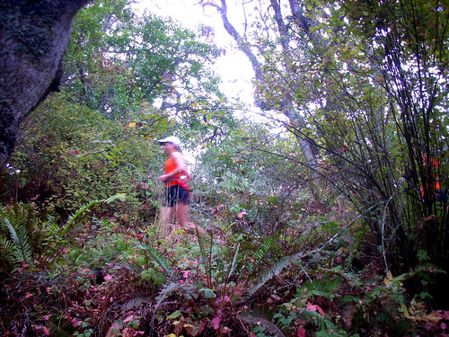
So here it is. Nothing groundbreaking, in fact you've probably seen this layout many times on other blogs, might even be the template of your own blog. It's been about 3 years since I launched my blog and I'm surprised how blogger has made it so much easier to customize minor things. I know very little html but I did manage to make the content area a little wider. Slightly bigger pictures:)
Was Bob the only one waiting with bated breath for the changes:) Ha, well it took awhile because I went on a great run on Saturday and it took the rest of the afternoon and early evening to recover. Then I went on another great run today. It was a great weekend of running. I tell ya I'm enjoying the focus on simply running, no swimming, no biking, just running.
Sunday, September 14, 2008
Subscribe to:
Post Comments (Atom)


I like the header but hard to see 365me ...I am on firefox.
ReplyDeleteok so it's a start :-) I am sure you can do better...haha tough blogger crowd huh!
Have a good week bro!!
I'm lovin it! Very nice header! ;D Dang if I were craftier I'd do one for myself LOL
ReplyDeleteIt's nice to make a change! : ) Personally, I like more color. But it's your blog...make it how you like it. : )
ReplyDeleteThe header's not showing up in Google Chrome, either. Other than that, everything's cool.
ReplyDeleteOoh...very pretty :)
ReplyDeletebob: hmmm I need to work on that. Tough crowd indeed. Way to stay motivated for Javelina.
ReplyDeletemarcy: You are crafty lady. No one can match you with the funny/bizzarre/scratch your head photos, that you put up on your site.
sarah: I'll see about adding more color. I actually mean to switch headers frequently. I do like how the white makes everything brighter and fresher. I guess I had the old template for awhile.
donald: It's missing in Google Chrome huh. Like not there at all? &$%(#@ alright back to the drawing board.
addy: Thanks teacher lady. Loved the photos from the anniversary weekend.
Nice! I dig the new look, Rick! Very clean, and very cool!
ReplyDeleteLove it! And thanks for texting:)
ReplyDeleteOK ... now it's there. Which one is you?
ReplyDeleteI like it Rick! Looks great!
ReplyDeleteOk now that is a SWEET header Bro... love the tag line also
ReplyDeleteLove the new look. I'm jealous. I am too blog "stupid" to figure out how to change anything.
ReplyDeleteOk. Yesterday I was gonna have to say something about this new look. "Hello. Mr graphic designer?!" But then you go and create that sweet-ass header and totally redeem yourself. Good stuff. I love it. You need to stick that in your portfolio.
ReplyDeletejean: Thank you, it was a fun and learning experience.
ReplyDeleteolga: Hey sure girlie. You were there when I needed you and I'd like to return the support anyway I can.
donald: none of them. I was the photographer:)
j~mom: Thanks. Thanks.
bob: Thought I'd take Sarah's comment and add more color!
kelly: So I actually looked online for some tutorials on how to hack this particular template. Such nice people to post that stuff for everyone to use.
mike: Ha, well you know, sometimes it works and sometimes it doesn't. The first one was just a quick draft, a place holder. See you this weekend. Saw that you 12 mile run went well. Good news!